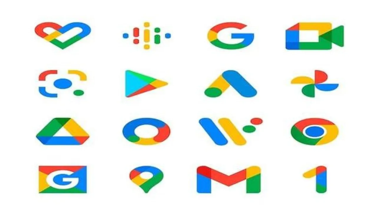
Khaberni - Google announced new updates that included the design of the "Google Maps" and "Google Photos" icons, in a step aimed at unifying the visual identity of its products in a style that relies on smart color gradation.
The new move from Google reflects its accelerated direction towards the full integration of design and artificial intelligence.
A new design language
These updates come as part of a broader plan to update the visual icons of Google services, where a color gradation style that merges the company’s four famous colors of red, yellow, green, and blue in a single sleek mix has been adopted, embodying what Google described as "the energy of innovation powered by artificial intelligence".
It started, according to a report published by PhoneArena, when the company earlier this year changed the icon of the main Google app, to adopt the style of overlapping colors, before applying the same approach to the logo of the Gemini app specialized in artificial intelligence.
Subtle changes
The new design of the Google Maps app maintains the famous "pin" shape, but it has become thinner and more prominent than before, with the central circular opening enlarged to appear more clearly on the screen.
The company also eliminated the double blue shadows that characterized the old version, and replaced them with a smooth color gradation that combines the four colors in a single harmonious palette, giving the icon a simpler and more elegant look simultaneously.
Google Photos
As for the "Google Photos" icon, it retained the design of the "fan" composed of four blades, but each blade now contains an internal color gradation starting from the center towards the edges, giving the icon a greater visual depth and vibrancy compared to the previous version with solid colors.
This change aims to make the icon more consistent with the new style adopted across Google interfaces, enhancing a unified visual identity that is easily recognizable globally.
Although the new updates have not yet been rolled out on all devices, as some phones like the Pixel 6 Pro still display the old icons, Google confirmed that the deployment will be gradual in the coming days to reach all users worldwide.
Developers expect that the next phase of this campaign will include Play Store applications, Chrome browser, and the calendar, which still rely on the traditional design with solid colors without gradation effects.
Unifying the visual identity
Analysts, according to PhoneArena's report, see that this visual transformation is not limited to the external appearance only, but comes as part of a broader strategy to unify the identity of Google products and connect them with the company's future vision based on artificial intelligence.


